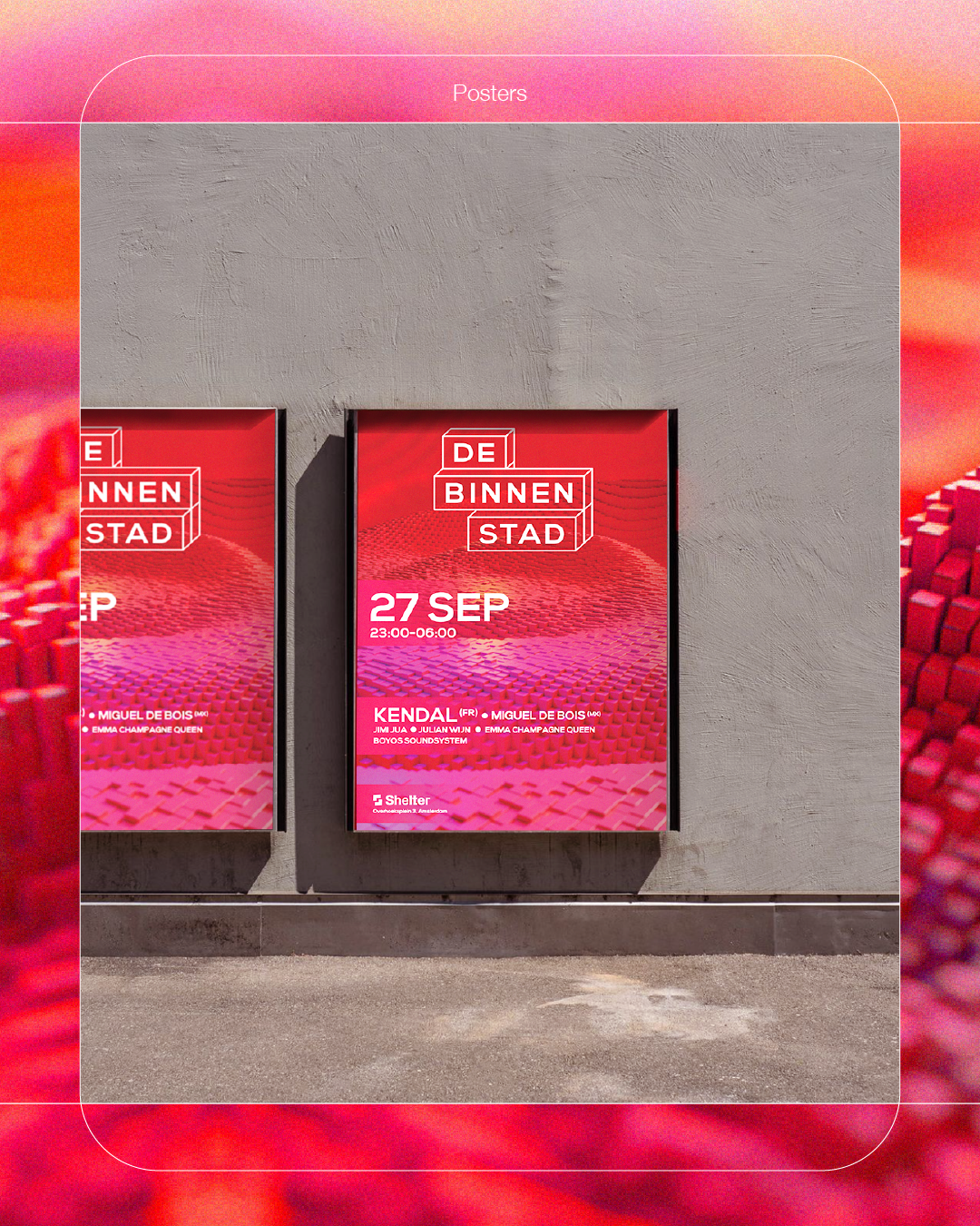
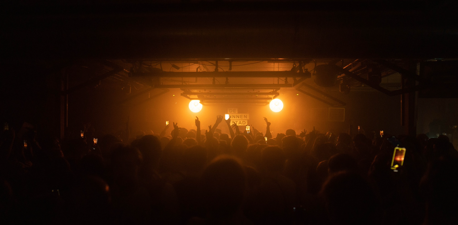
De Binnenstad
is a fast growing festival located in Amsterdam. Their concept is to bring all kinds of elements that can be found at a festival to the club in order to offer the ultimate experience. Delivering on this promise, De Binnenstad needed a brand identity system that embodied their values.
LOGO
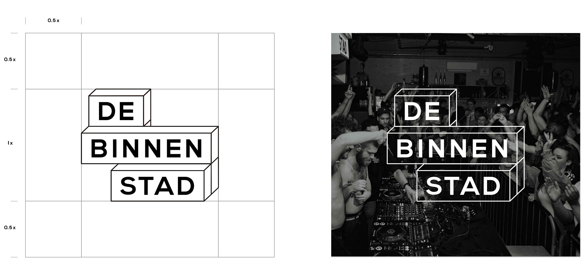
A logo that communicates
Given De Binnenstad’s name & core, I introduced a logo inspired by the elements of a city. Communicating the most important trait - playfulness - reinforced by the rectangles shaping the logo together.
Visual Identity
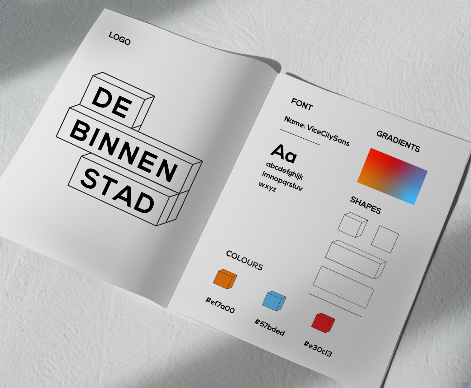
A flexible, recognizable design language
The identity system uses a distinct set of brand elements that return throughout the language. The core shape, the building blocks, are a repeating element in the identity of De Binnenstad. The playfulness is reinforced by a diverse energetic color palette.
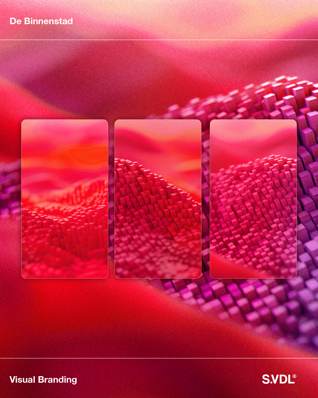
Promotional Materials
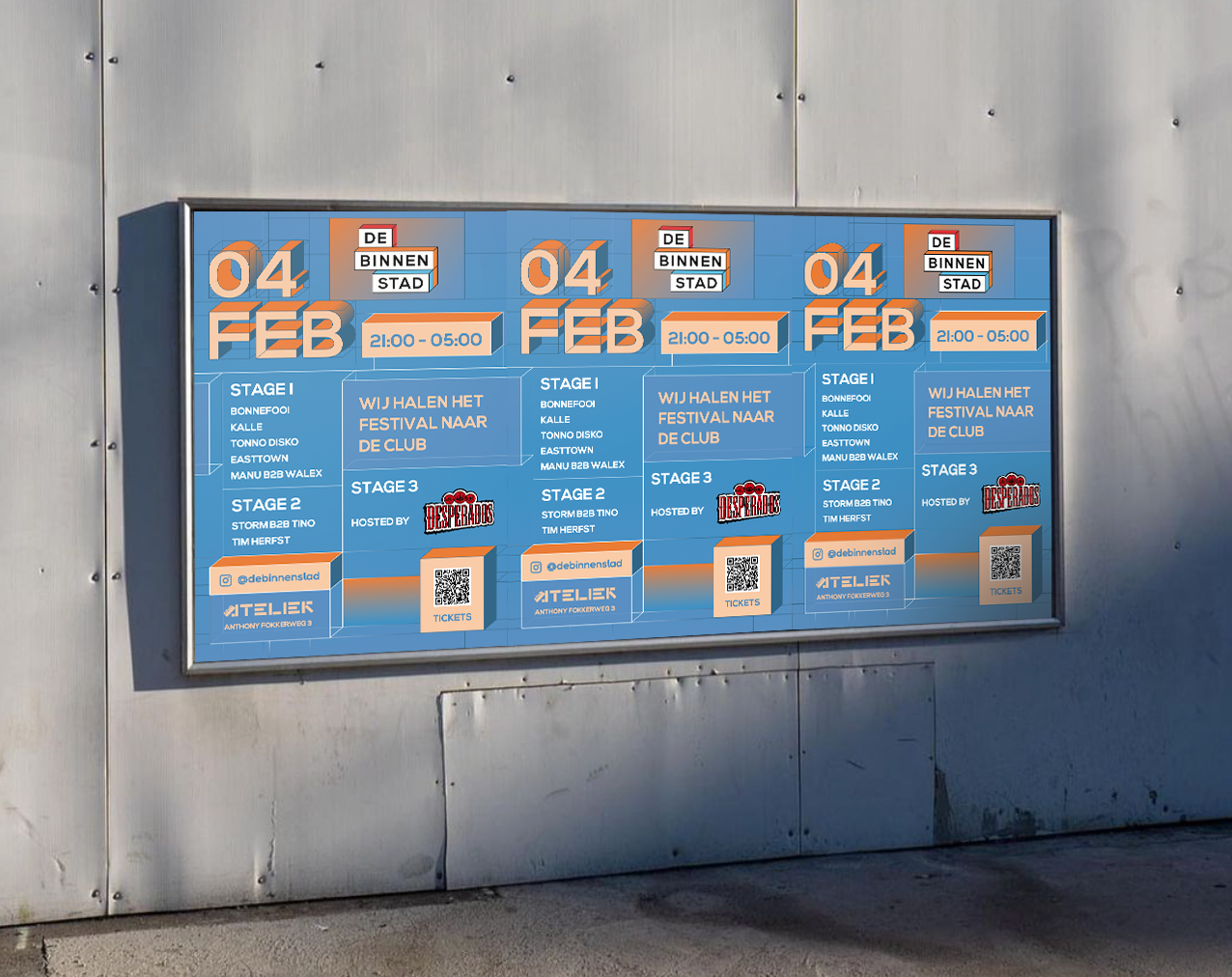
Bring the brand alive. To further incorporate the essence of the logo and elements, the language is translated into 3D renders.